company rebrand
This was a rebrand for an already established and successful company, so had to be treated sensitively, respecting and echoing it's roots whilst bringing the brand firmly up to date.
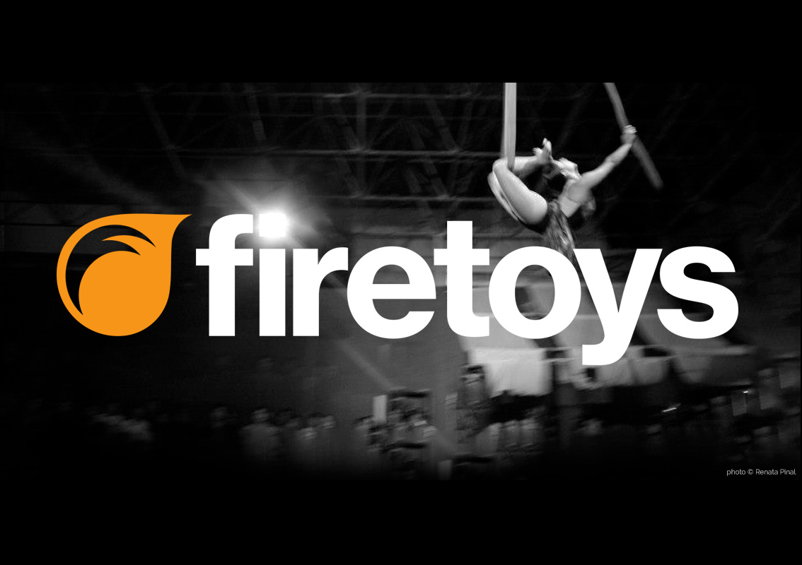
The online retail company has a strong sense of community with their customers and I wanted to reflect that with the icon's shape, emulating speech bubbles...whilst also incorporating a representation of the titular fire. The 'F' shape inside took form from the original logo's typeface, yet the modern but classic new font allowed the brand to appeal to a wider market than previous.
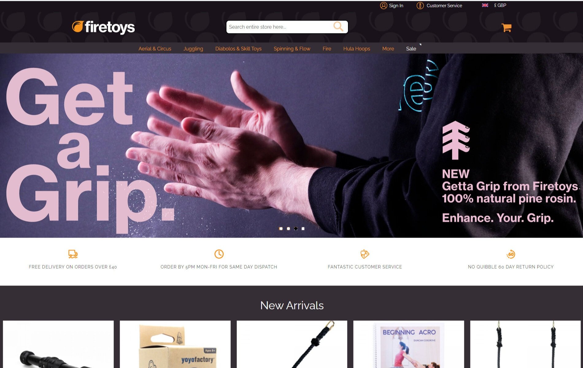
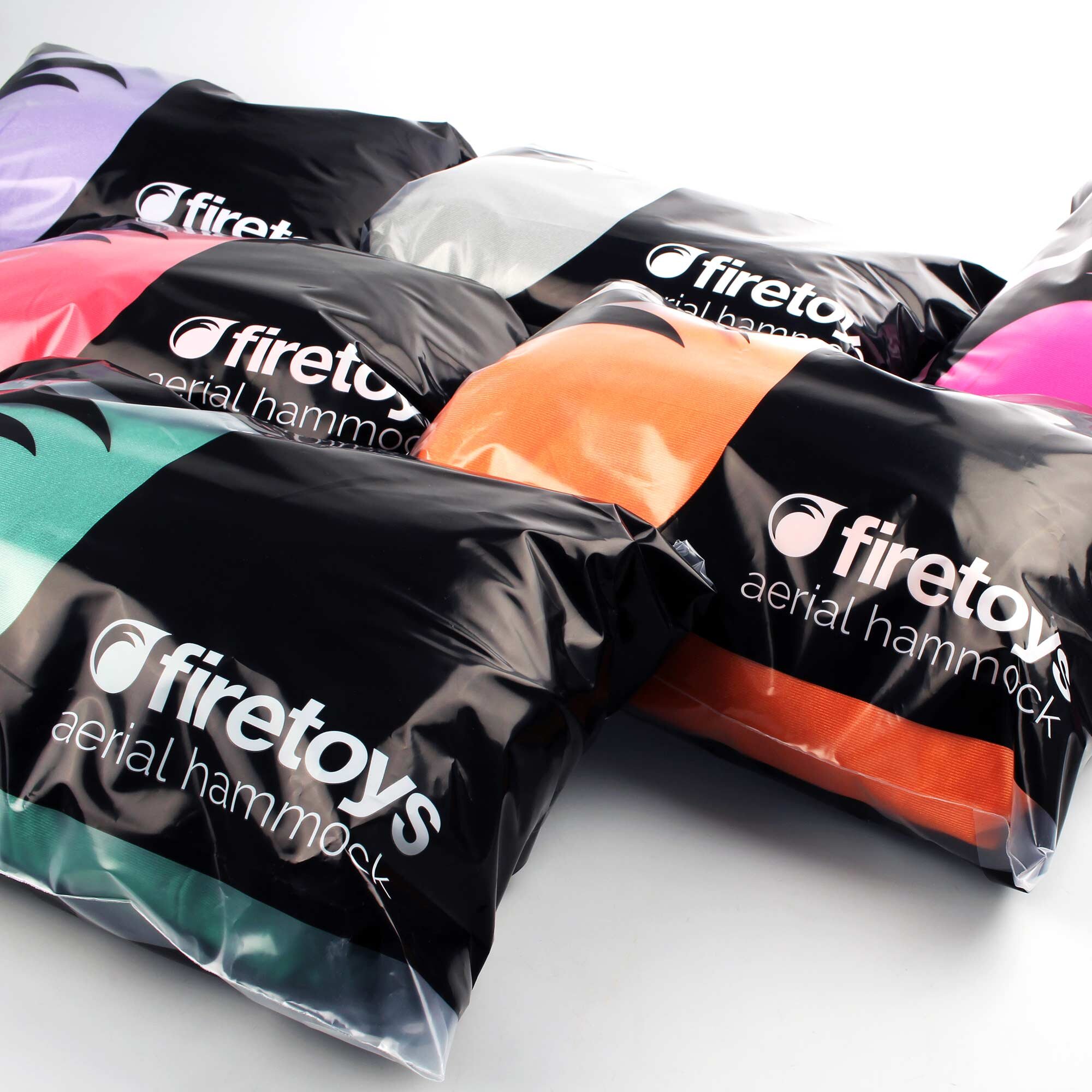
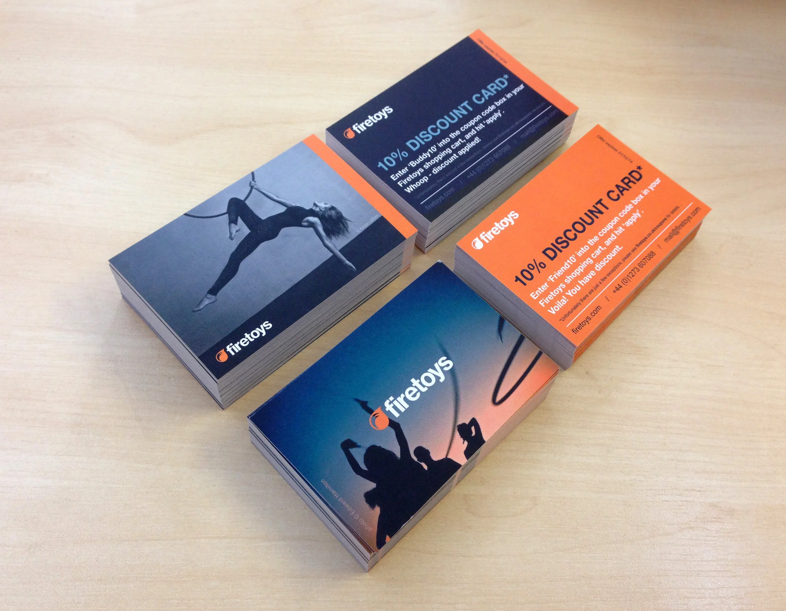
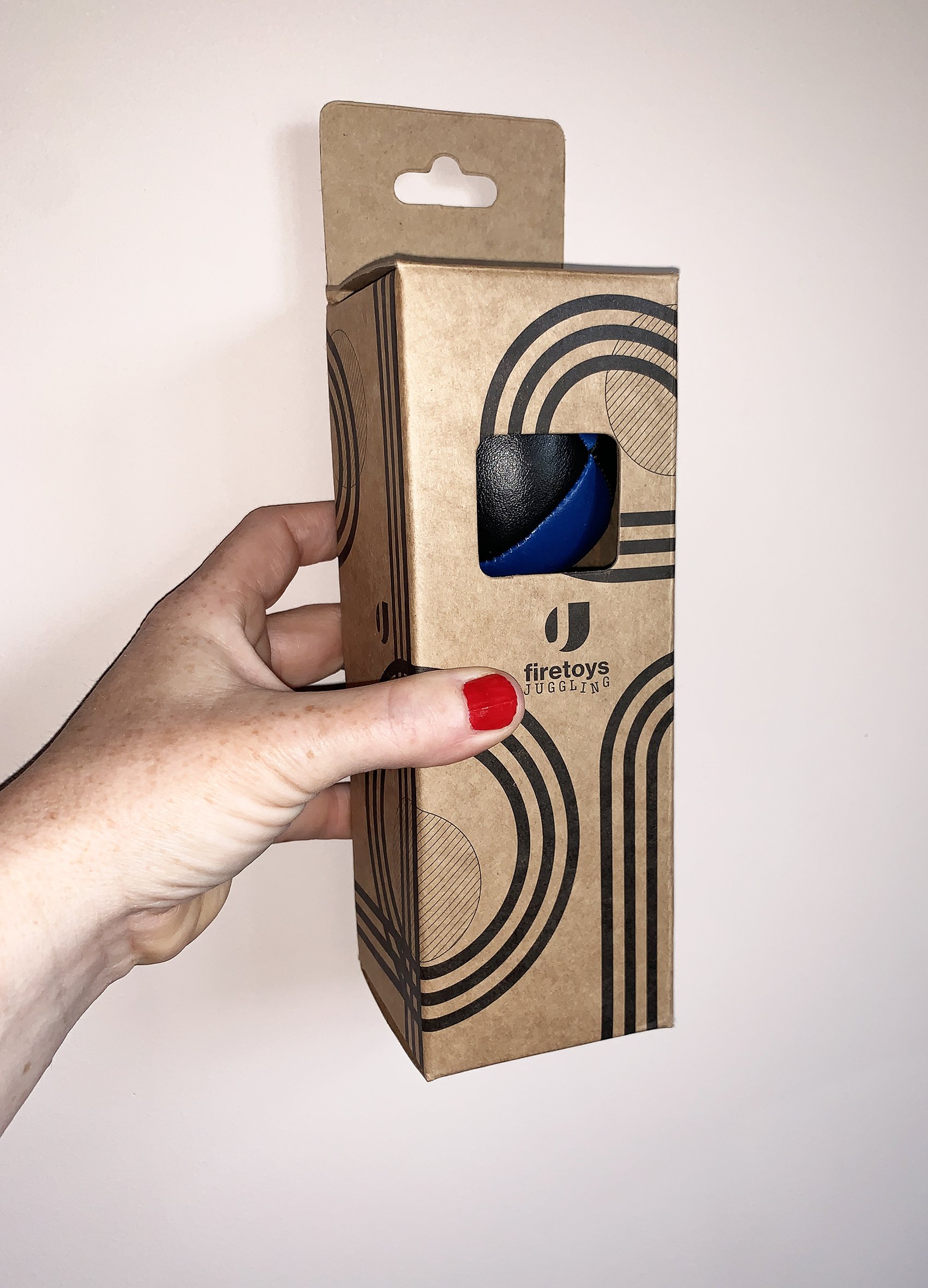
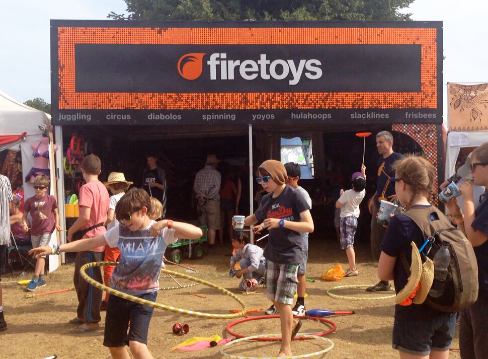
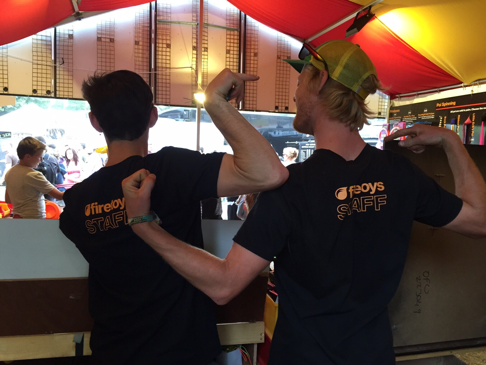
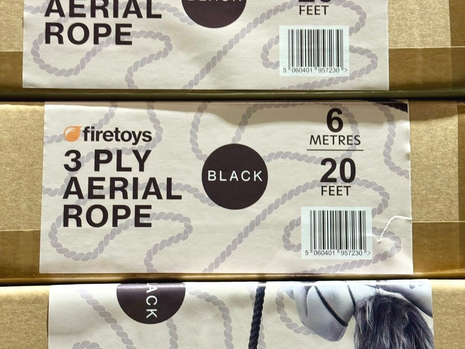
As you can see from the additional images, this logo has successfully been used across many platforms and in many forms.
