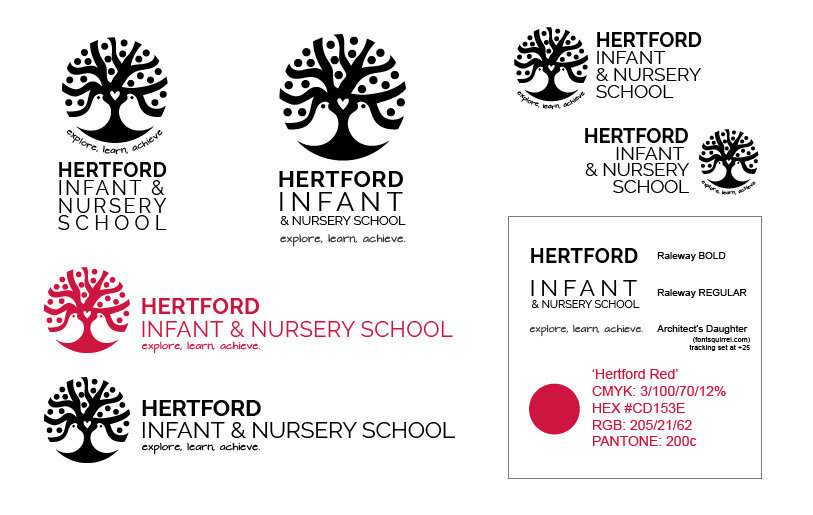
Logo update for a primary school
The dated logo needed an overhaul as part of a push to boost the school's profile in the area. The previous logo featured two birds under a tree, so I worked with these elements to modernise and refresh the image.
As this was a logo for an infant school, it had to be friendly, modern, and have a universal appeal. From the offset I saw the logo being reworked in a scandi style as the direction to take, with it's references of love and warmth and community.
I produced a media package for the school to use in colourways of black, white and red, a range of alternate compositions for different placements, and in files for both use in print and web.
Projects with the school is ongoing - recent additions include a 30 page handbook and icons for a 2020 teatowel.


